Problem
Users arrived intending to subscribe. The sales funnel page stopped them.
The team identified a concerning pattern. Although traffic to the subscription page was relatively high, most users who started the checkout process did not complete it.
The issue was not the price, but the experience and interactions on the subscription page itself. Users found the subscription flow too long, distracting, and confusing. In addition, most users were older adults with limited technology skills. For a media company transitioning from print to digital revenue, every abandoned checkout represents a direct, measurable loss.
A UX heuristic evaluation of the existing subscription page revealed several structural issues that directly hindered checkout completion:
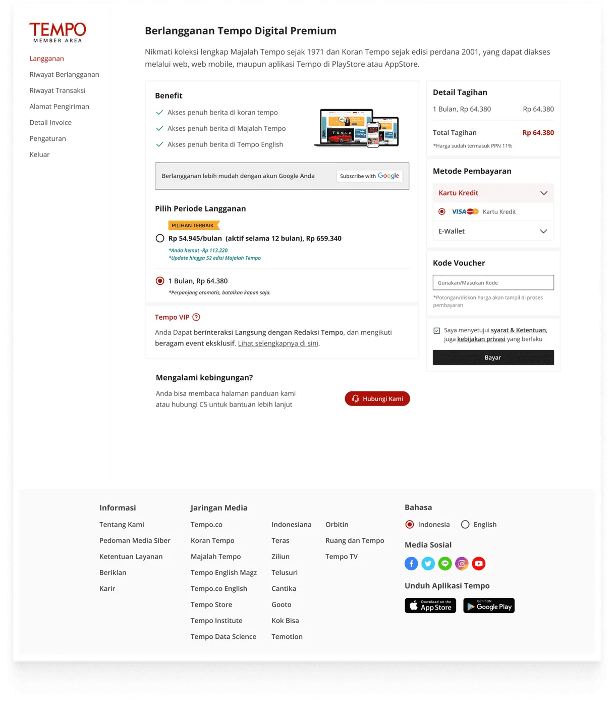
Seven navigation options remained available while users were in the payment flow, creating many opportunities to leave the page before completing the transaction.
The benefits section, Google Subscribe CTA, period options, Tempo VIP upsell, payment methods, and voucher code all appeared on one screen without a clear visual hierarchy.
The promotional section was placed between the period options and payment panel, distracting users who were ready to complete the transaction.
The primary CTA was only available in the lower-right column, making it difficult to reach naturally for users reading from left to right.
The message “automatically renews, cancel anytime” appeared only as small italic text, even though this crucial information affects user trust.
Role
One designer, full responsibility.
I was the sole designer on this project, with full responsibility from problem identification through developer handoff. The project lasted one month, in collaboration with a Product Manager who connected business needs with design decisions. Every design decision was made and presented directly to the Head of Product.
Challenge
Limited room to solve a real problem.
This was a challenging project. In addition to the many complex issues, there was limited room to solve them, including:
- Backend stays as isFirst, the changes could not significantly affect the backend structure. The solution had to be designed within the limits of the existing system.
- Third-party constraintsSecond, Tempo worked with several third-party services in its payment process, so not every design decision could be implemented, and the available components had already been determined.
Design Ideation
Exploring a shift to a single-page form
From the sequence of issues above, I identified the biggest problems with the current page:
- 1Too much content was displayed
- 2The content was poorly organized
- 3The three-column layout with an active sidebar forced users to split their attention among the content on the left, the payment panel on the right, and the always-available navigation. There was no single clear direction to follow.
I explored a single-page form system, structuring the content from top to bottom based on several fundamental design principles:
Gestalt: Law of Continuity
The human eye naturally follows continuous lines and flows. A single vertical flow creates a clear, uninterrupted reading path.
Jakob's Law
Users spend most of their time on other platforms. They are already familiar with a linear, single-form checkout pattern from top to bottom, making it the most recognizable approach.
Design Exploration
First exploration: the right concept, but not enough.
The first exploration, V1, was built around one main concept: simplifying checkout into a single page with a linear top-to-bottom flow. The navigation sidebar was removed entirely, package options were displayed side by side for easy comparison, and a “Step 1 of 4” progress indicator helped users understand how far they had progressed.
From a UX perspective, V1 addressed the main issue. However, after reviewing it with the PM, we identified UX issues as well as business and technical needs that had not yet been accommodated.
Information about Tempo subscription benefits
More payment methods than the current version offered
An always-visible help feature for customers who experienced difficulties
Some sections like login and pricing appear to have excessive height and lack compactness, forcing the user to scroll down.
Iteration And Final Solution
Final solution: bridging design ideals and business reality.
V2 was created to bridge the design decisions in V1 with real business and technical constraints. The core principles remained: one column, no sidebar, and a linear flow. However, several adjustments were made.
V2 introduced several design decisions, each based on a specific consideration. Below are the three main decisions and the reasoning behind them.
Pricing changed from cards to a list
In V1, monthly and annual packages were displayed as two horizontal, side-by-side cards. In V2, this format was replaced with a vertical list using radio buttons. This was not merely an aesthetic decision: it encouraged users to read from top to bottom because the structure was more sequential and easier to scan, while also aligning with the components above it. From a UX perspective, a vertical list with radio buttons was more appropriate for this context. When users can choose only one of two options, radio buttons are the most familiar and unambiguous form pattern. Side-by-side cards risk suggesting that both options can be selected together or creating excessive visual hierarchy. The card with the lowest price is intentionally placed at the top to make it more visible and influence buyer decisions; the addition of a "Best Choice" badge makes this card stand out even more.
Added a Help button
The old checkout page contained one unintended but revealing detail: a “Feeling confused?” section at the bottom of the page. Its presence implicitly acknowledged that users needed help during the process. However, placing it at the bottom meant users had to become confused before they could find assistance. In V2, the Help button became an always-accessible floating element. Its purpose was not to divert users from checkout, but to reduce anxiety throughout the process. A visible support path provided reassurance, especially for first-time subscribers.
Added a Subscription Benefits Section
The bottom sticky prompt, “What are the benefits of subscribing to Tempo Digital?”, addressed users who did not understand the value and benefits of a Tempo subscription. Not everyone was aware of them. The section’s primary purpose was to educate users while highlighting the benefits they would receive. This section was designed to present subscription benefits briefly and clearly. Positioned at the bottom of the screen as a sticky element, it provided information without disrupting the main flow while remaining accessible to users who needed it before deciding to pay.
V2 aimed to address the needs of both users and the business team within the existing problems and challenges, including technical constraints, third-party involvement, and requirements that could not be ignored. V2 represented the best balance achievable between a better user experience and the realities that had to be accommodated.
Results
The subscription conversion rate more than doubled.
After V2 launched, Tempo’s digital subscription conversion rate increased by 108%. This result showed that the changes, despite technical and business constraints, successfully addressed the main issue identified at the outset: far more users who arrived intending to subscribe now completed the process through payment.
Limitations & Next Steps
What I would do differently with more time.
Like most design decisions made in a real business context, V2 was not without compromise. Several areas were noted for future iteration.
- Hero Banner ProportionThe business team used the hero banner as promotional space. While this made sense from a business perspective, its large size forced users to scroll farther before reaching the first action. Ideally, this promotional space would be more proportionate so it would not compromise quick access to the main form.
- CTA Button PositionThe “Start Subscribing” button was located at the very bottom of the page. Users who were not accustomed to scrolling to the end could easily miss it. A solution worth exploring is a sticky CTA bar that follows the user as they scroll, keeping the button within reach without significantly changing the page structure.
- Better gather feedback with Usability TestingWith a one-month timeline and limited resources, many design decisions relied on heuristic analysis and internal feedback. If the project were revisited, usability testing with real users before launch would be the highest-priority step to identify friction that may not yet have been detected.